Identifying and Repairing Catastrophic Errors in Galaxy Properties Using Dimensionality Reduction
Research conducted with Dr. Charles Steinhardt at the Cosmic Dawn Center, Niels Bohr Institute in Copenhagen, Denmark.
Modern surveys are able to observe large numbers of galaxies because they use photometry, observing a few bands for each galaxy, rather than the more time-consuming spectroscopy, observing the galaxy's entire spectrum.
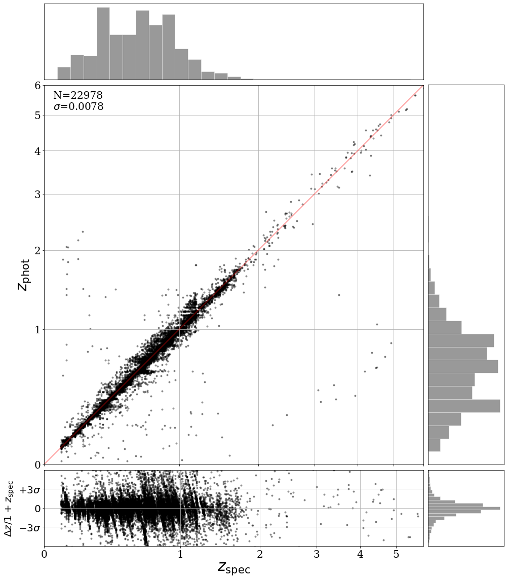
Typically, a template fitting code is used to determine each galaxy's properties from its photometry. However, for a few percent of galaxies in every survey, the derived properties can be catastrophically wrong (Figure 1), such as labeling relatively nearby galaxies as some of the farthest in the universe. Because there is no way to know which galaxies have these catastrophic errors in their derived properties, the errors contaminate all studies of galaxy properties based on photometric surveys.

To determine which galaxies have these catastrophic errors, we develop an augmented algorithm as follows:
Run a template fitting code, EAZY, to determine a photometric redshift for each galaxy.
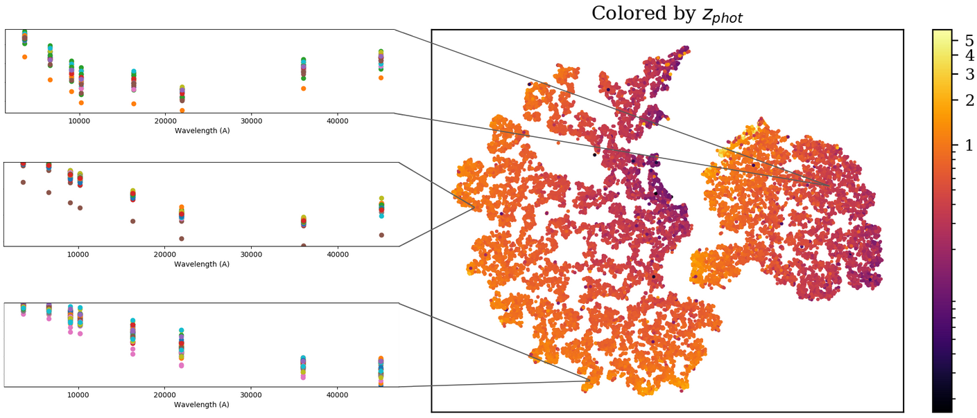
Use the dimensionality reduction algorithm t-SNE to group objects with similar photometry. Color the t-SNE map by photometric redshift (Figure 2).
Galaxies with similar photometry should have similar redshift, so any object which has a very different photometric redshift than its nearest neighbors on the t-SNE map gets flagged as a potential catastrophic error.

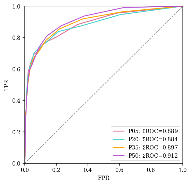
An ROC curve demonstrating the effectiveness of this method is shown in Figure 3. The curve lies far above the diagonal dashed line, meaning that the True Positive Rate (TPR) is much higher than the False Positive Rate (FPR), and the method consistently correctly identifies errors at a much higher rate than it misidentifies correct objects as errors.

Header image: NASA/ESA/Hubble(STScI)